
Its fragrance formula does not solely determine a perfume’s premium value. As the first visual and tactile touchpoint for consumers, the matching of perfume bottle caps and bottle bodies directly defines the product’s grade, aesthetic temperament, and market positioning. Even with high-quality glass materials and exquisite fragrance craftsmanship, mismatched cap shapes, materials, proportions and finishes will create a disjointed, low-end visual effect. In contrast, scientific and aesthetic bottle-cap coordination can polish overall details, deliver a sense of sophisticated ritual, and significantly upgrade the product’s luxury texture and brand appeal with subtle design techniques.
This article elaborates on professional matching rules for perfume bottle caps and bottles from four core dimensions: shape proportion, material collocation, craft detail, and color harmony, helping perfume products get rid of low-end homogeneity and present high-grade boutique quality.
1. Shape Matching: Unified Silhouette and Balanced Proportion
The core principle of shape design is visual unity and balanced hierarchy, avoiding top-heavy structure or conflicting lines. Reasonable silhouette coordination can integrate the cap and the bottle into a complete artistic whole.
1.1 Homogeneous Silhouette for Minimalist Luxury
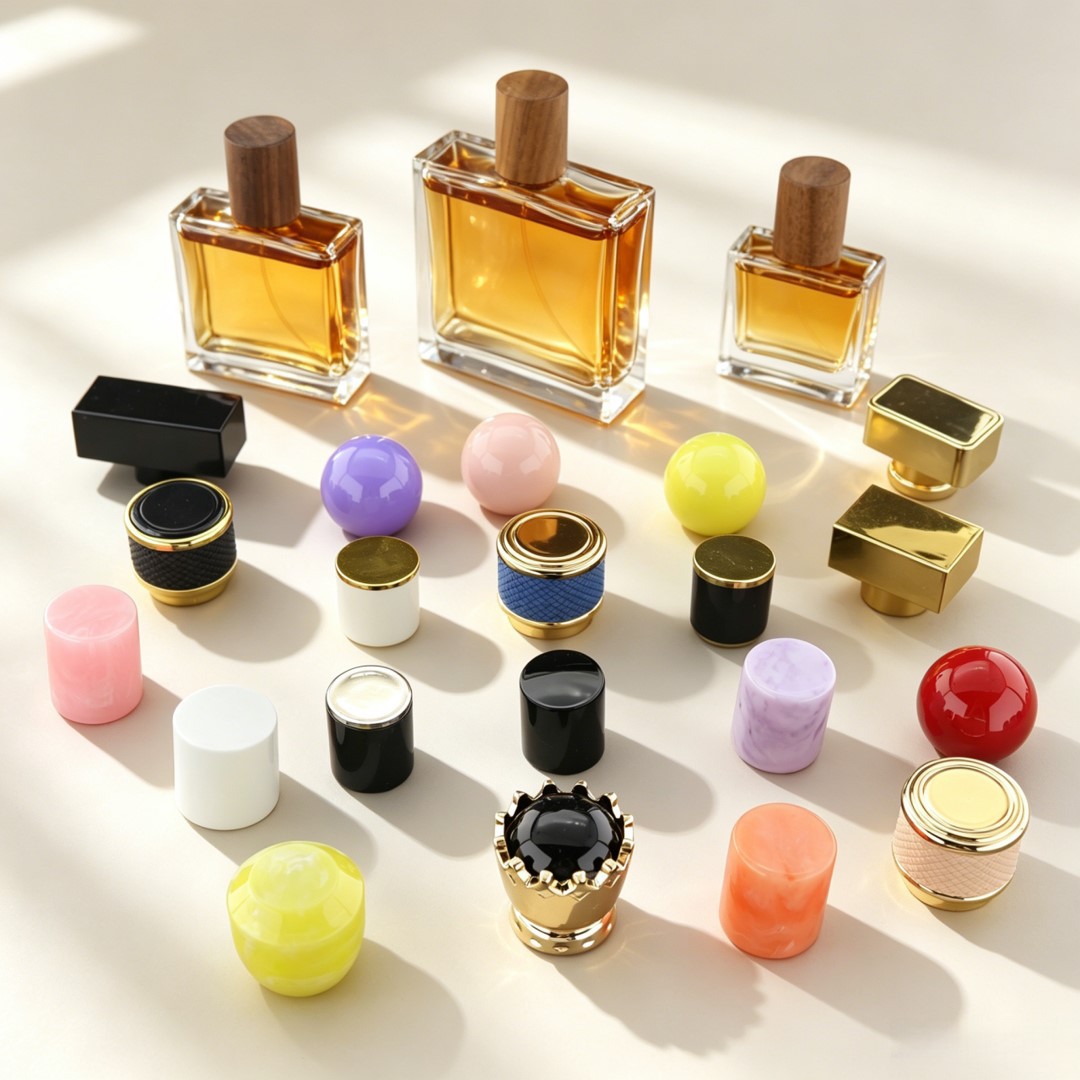
Maintain consistent line characteristics between the cap and the bottle. Straight, angular square or rectangular glass bottles are perfectly paired with flat-cut square metal caps or geometric polygonal caps; round, curved and streamlined bottle bodies match spherical, arc-top and dome-shaped caps. The continuous and smooth visual lines convey a minimalist, advanced and restrained aesthetic, which is highly suitable for niche salon perfumes, neutral colognes and modern light-luxury fragrance lines. In terms of proportion, the height of the cap should be controlled at one-fifth to one-quarter of the total bottle height to ensure a slender and elegant overall posture without bulky and clumsy visual perception.
1.2 Contrasting Silhouette for Layered High-End Sense
Proper contrast between square and round shapes can create unique visual tension and enhance product recognition. Rigid geometric square bottles with sharp edges can be paired with soft round arc caps; smooth curved bottle bodies can be matched with faceted cutting caps with distinct angles. The combination of rigidity and softness breaks the monotonous design of conventional perfume packaging, bringing rich layered texture and classic luxury temperament, which is widely used in high-end classic women’s fragrance and limited-edition perfume series.
2. Material Collocation: Tactile Contrast Improves Grade
Material texture is the most intuitive standard to distinguish low-end products from premium perfumes. The organic matching of different materials can form a delicate tactile and visual difference, effectively enhancing the product’s sense of value.
2.1 Metal Caps — The First Choice for Premium Texture
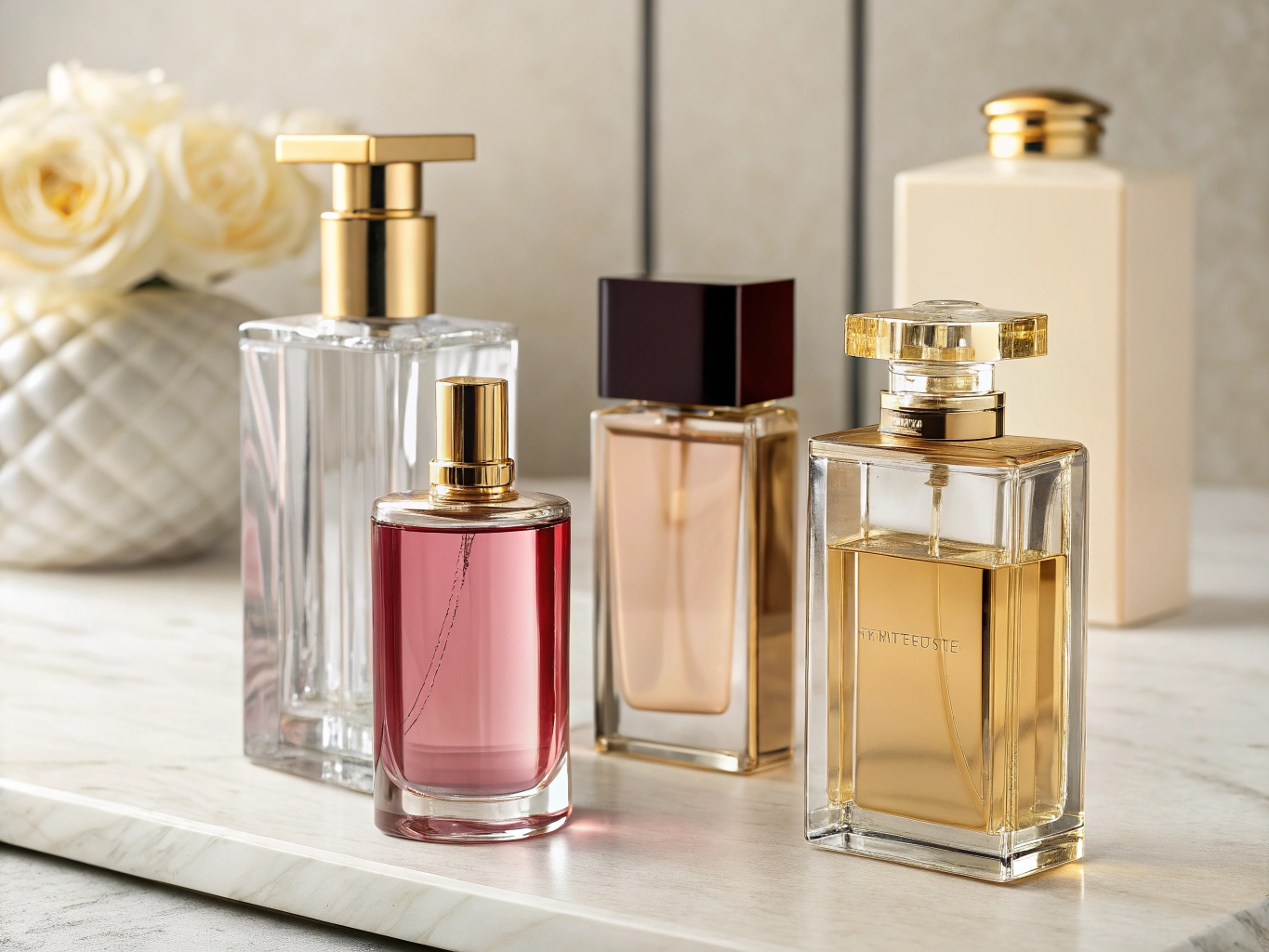
Zinc alloy, aluminum alloy and brass metal caps feature solid texture, stable weight and delicate metallic luster, which are the core materials for high-grade perfume matching. Transparent clear glass bottles adapt to matte silver and matte gold metal caps; the low-key and non-glossy electroplating effect highlights advanced cold luxury, suitable for woody, aquatic and neutral fragrances. Retro amber and tea-colored glass bottles are perfectly matched with antique bronze and vintage brass caps, restoring classical retro texture and fitting oriental, leather and vanilla heavy fragrances. Frosted gray and frosted white glass bottles pair with gunmetal black brushed metal caps, creating a cool, sophisticated and modern boutique style.
2.2 Crystal & Glass Cutting Caps — Luxurious Ritual Sense
High-transparency diamond-cut crystal caps and glass caps are ideal for gift-oriented and high-end women’s floral fragrances. The sparkling light refraction of the cutting surface echoes the clear glass bottle body, presenting jewel-like delicate luster and strong ceremonial sense. To avoid gaudiness, it is necessary to match simple and clean plain glass bottles, and avoid overly patterned or gradient bottle bodies, so as to keep the overall elegant and high-end.
2.3 Matte Resin & Wooden Caps — Natural Niche Temperament
For niche natural perfumes such as citrus, herbal and tea fragrances, matte frosted resin caps and log texture caps are the best choice. Paired with all-matte frosted glass bottles, the whole bottle abandons excessive glossy reflection, presenting a soft, healing and low-key artistic texture, which is different from mainstream commercial perfumes and highlights unique brand tonality.
Material Matching Taboo
Never match high-grade thickened glass bottles with thin glossy plastic caps. The disjointed weight and inconsistent texture will directly expose low-cost production and completely weaken the premium sense of perfume products.
3. Craft Details: Subtle Polishing Determines Premium Limit
High-end perfume packaging wins in details. On the basis of correct shape and material matching, exquisite surface technology and structural design can further upgrade the product’s sophistication.
First, keep the surface texture unified. Frosted bottle bodies must be matched with matte caps; brushed glass textures correspond to brushed metal caps; smooth glossy bottle bodies adapt to polished bright caps. The consistent surface technology eliminates fragmented visual feeling and presents integrated precision craftsmanship.
Second, optimize the connection structure. Premium perfumes will be equipped with matching metal neck rings and transition rings between the bottle mouth and the cap, which perfectly cover the assembly gap, making the cap and the bottle body closely integrated without abrupt layering. In addition, the magnetic suction opening and closing structure of high-end metal caps brings a stable and crisp opening sound and solid hand feel, greatly improving the user’s ritual experience and high-end perception.
Third, simplify logo technology. High-grade products abandon crude color printing. They adopt laser engraving, concave-convex embossing and metal hollow-out logos on caps, matched with minimalist hot stamping and silver printing on bottle bodies, showing subtle brand details without trivial decoration.
4. Color Harmony: Low-Key and Restrained Luxury Aesthetics
High-end perfume color matching always adheres to the two-color principle, avoiding messy and exaggerated color superposition. The cap color needs to echo the main tone of the bottle body to form an integrated color system.
Classic universal high-grade combinations include: clear transparent bottles with matte black and dumb gold caps (versatile for men and women’s neutral fragrances), tea retro bottles with antique bronze caps (classic retro style), frosted cold gray bottles with gunmetal black caps (modern minimalist salon style), and light pink transparent bottles with rose gold matte caps (gentle lady luxury style). Avoid adding fancy colors, diamond inlays and colorful decorations on the basis of colored bottle bodies; excessive decoration will destroy the advanced blank sense and make the product appear tacky.
Conclusion
The matching of perfume bottle caps and bottles is a systematic aesthetic design, not a simple accessory assembly. Through reasonable proportion control, material contrast, detailed craftsmanship and color unity, brands can easily get rid of the homogenized low-end packaging dilemma. A well-matched bottle cap is the most cost-effective way to enhance product premium texture, allowing perfumes to convey sophisticated brand temperament at first sight and touch, and winning higher market recognition and product premium space.